
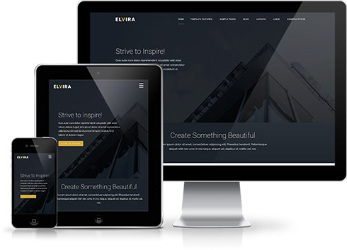 It has become common knowledge that every day the number of mobile devices used to view your site grows. Responsive design gives your site the power to provide an optimal viewing experience across a wide range of devices from a mobile phone to a desktop computer monitor.
So how does it work? With the use of media queries different CSS style rules are loaded depending on characteristics of the device your site is been viewed with, most commonly the width of your browser. With each set of rules your site will be styled to best display on the matching device.
At EyeMotion we have implemented responsive design to all our new releases, resolving any problems associated with how your site will display on smaller resolution screens. To view how your template will respond to each screen resolution simply resize your browser window, as you reduce the width of your browser the template will react accordingly, altering its layout and style to best accomodate the site content within the available viewing area.